Welcome to our digital Style Guide
Here you’ll find guidelines for both our print materials and our website.
Print Style Guide
Quick links to navigate the print section:
Identity
A logo is the visual summary of a brand. It holds together key elements of the brand in a tidy little package. So it is important that the logo is used consistently as illustrated in this style guide.
The following are examples showing a white version of the logo on bright and dark coloured backgrounds. (Note: Nordic may be used for the logo where contrast is sufficient—e.g. on Sandy Brown.)
The following are examples showing a white version of the logo on bright and dark coloured backgrounds. (Note: Nordic may be used for the logo where contrast is sufficient—e.g. on Sandy Brown.)
The following are examples—not exhaustive. The logo may be white on a darker background. Or a range of the light shades in the colour scheme would also be appropriate for use on a darker background colour.
Typography
Large headings use Morganite Bold or Semibold. All its weights can be downloaded for free from Gumroad (click here). Note that all headings using Morganite should appear in UPPERCASE.
MORGANITE Bold
MORGANITE SemiBold
For feature headlines you may like to use Morganite Semibold with 200% tracking as per the ‘Fear Not!’ theme title.
Fear Not!
[Set in Morganite Semibold]
Small Heading — DM Sans Bold — 700
We have used DM Sans for body copy. Its heavier weights are suitable for smaller headings.
DM Sans is a free, open source font and can be downloaded here.
DM Sans Regular – 400
DM Sans Medium – 500
DM Sans Semibold – 600
DM Sans Bold — 700
Colours
Vulcan
(#0F141F)
Black Pearl
(#05111E)
Nordic
(#063A42)
Satin Linen
(#E8E5D4)
Orange White
(#FCFAEE)
White
(#FFFFFF)
Primary: Blue Dianne
(#054C53)
Secondary: Smalt Blue
(#3F685E)
Accent: Sandy Brown
(#FFA449)
Hampton
(#E4DBAB)
Coriander
(#BAB48C)
Bull Shot
(#8F4700)
Pantone 5463 U
(#3E4E56)
Pantone 804 U
(#FFAA52
Theme Graphics
Please note: there are two alternative versions of the theme design. The screen version includes a dark overlay (with low opacity) to create more contrast between the tagline (‘The Lord is Near’) and the background illustration. However this layer is removed for print situations where the illustration will already appear darker when printed. (Examples below for 16.9 aspect ratio.)
There is also an alternative portrait version of the illustration used for the 9.16 Instagram story post and A5 booklet cover.
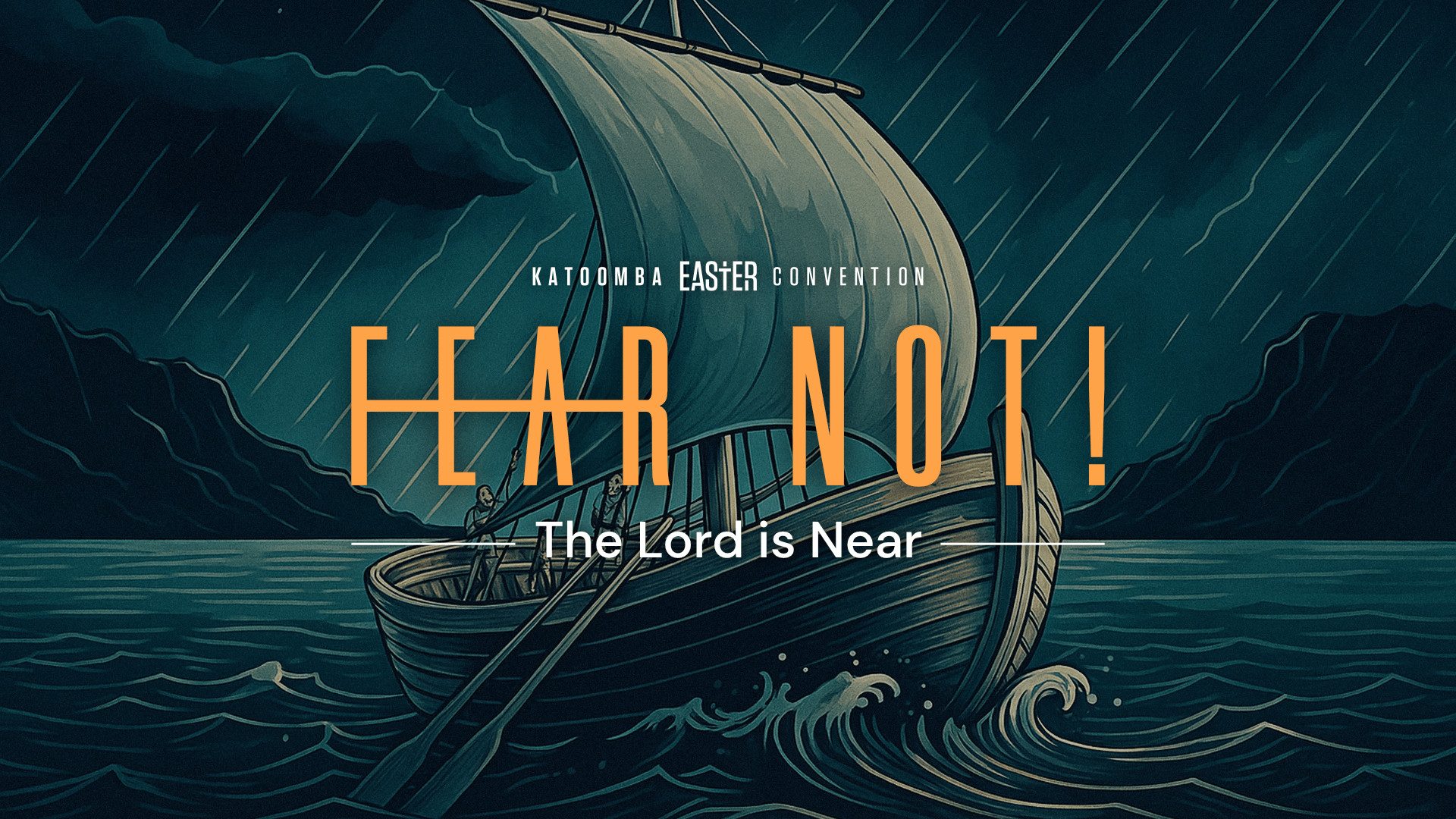
16.9 / 1920 x 1080 (For Screen, Darker)
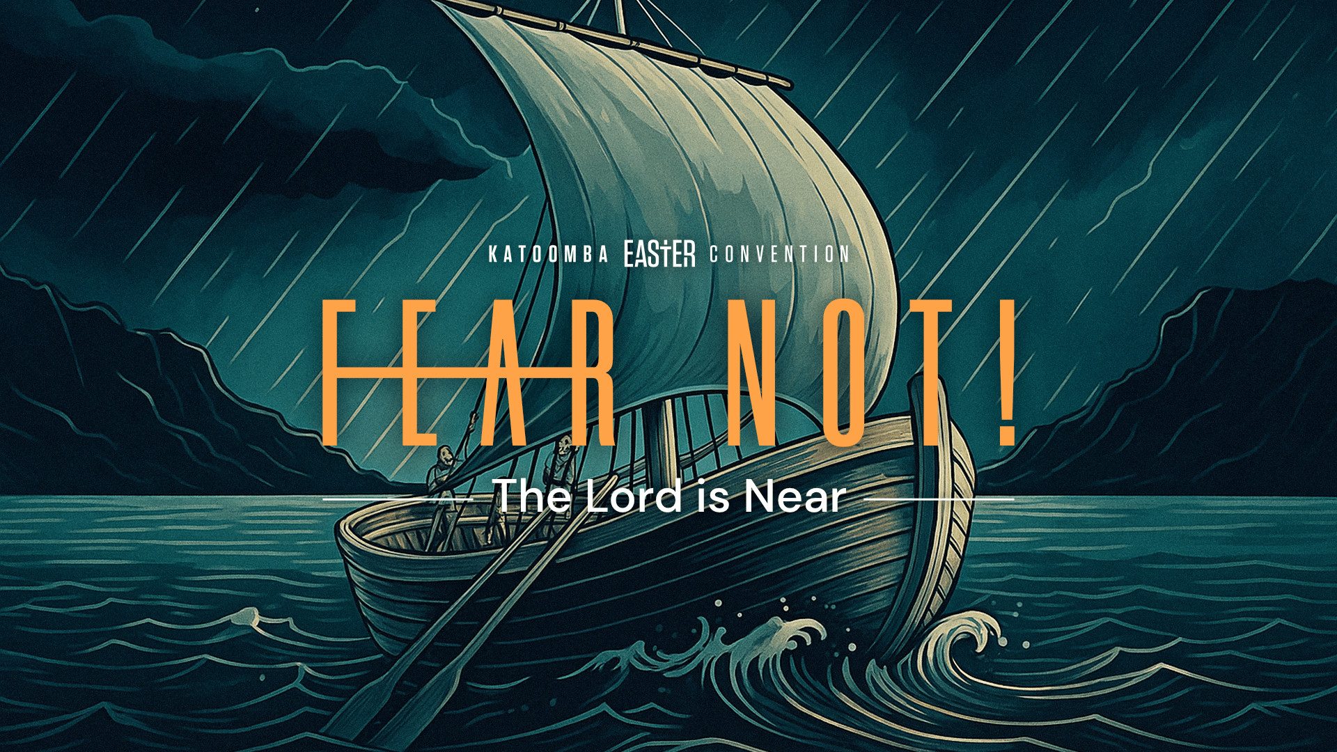
16.9 / 1920 x 1080 (For Print, Lighter)
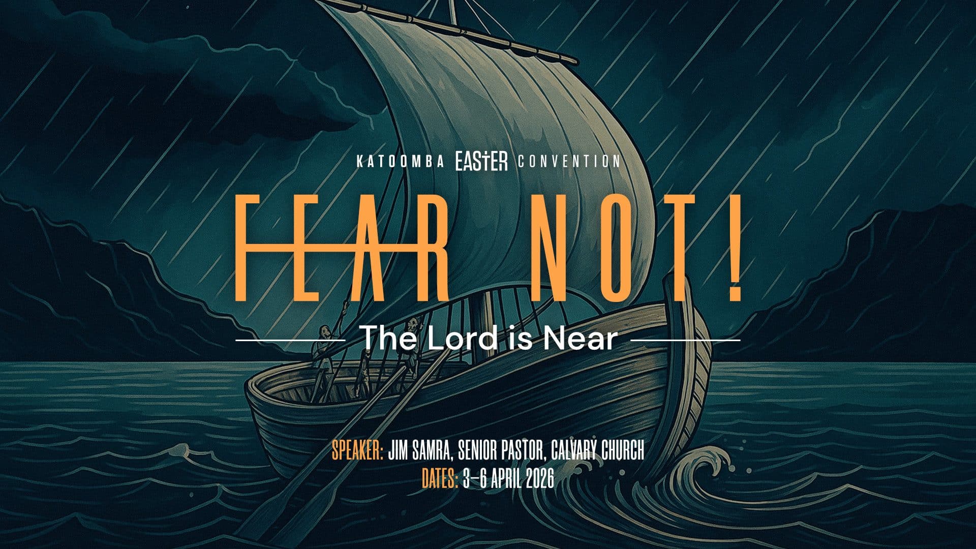
16.9 / 1920 x 1080 (Featuring Speaker & Dates)
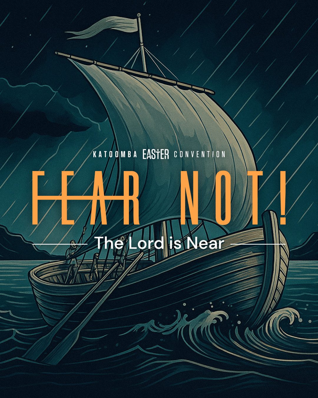
Instagram Post / 1080 x 1350
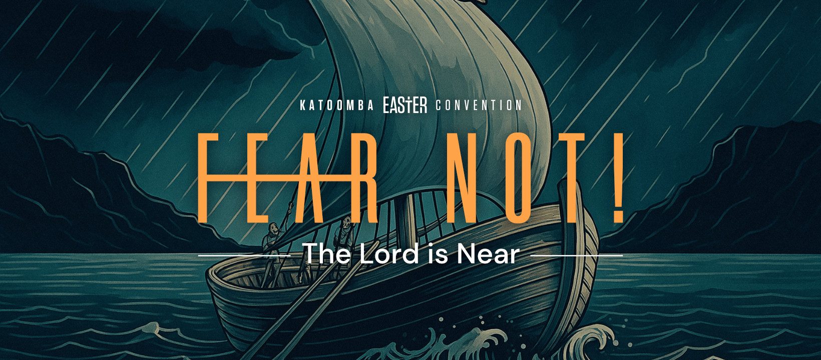
Facebook Cover Image / 1640 x 720

Instagram Story / 1920 x 1080 (Alternative Portrait Illustration)
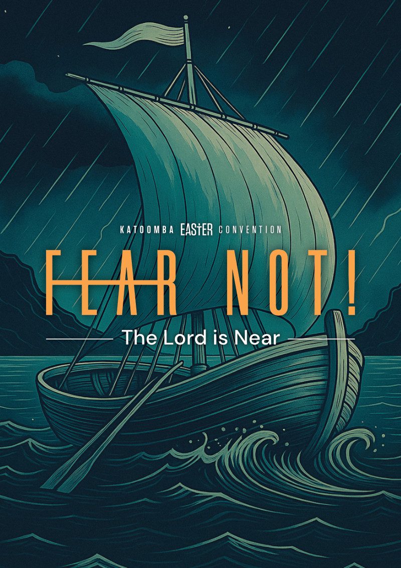
Booklet Cover / A5 (Alternative Portrait Illustration)
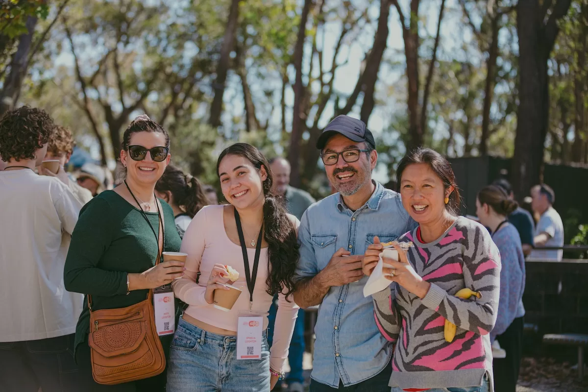
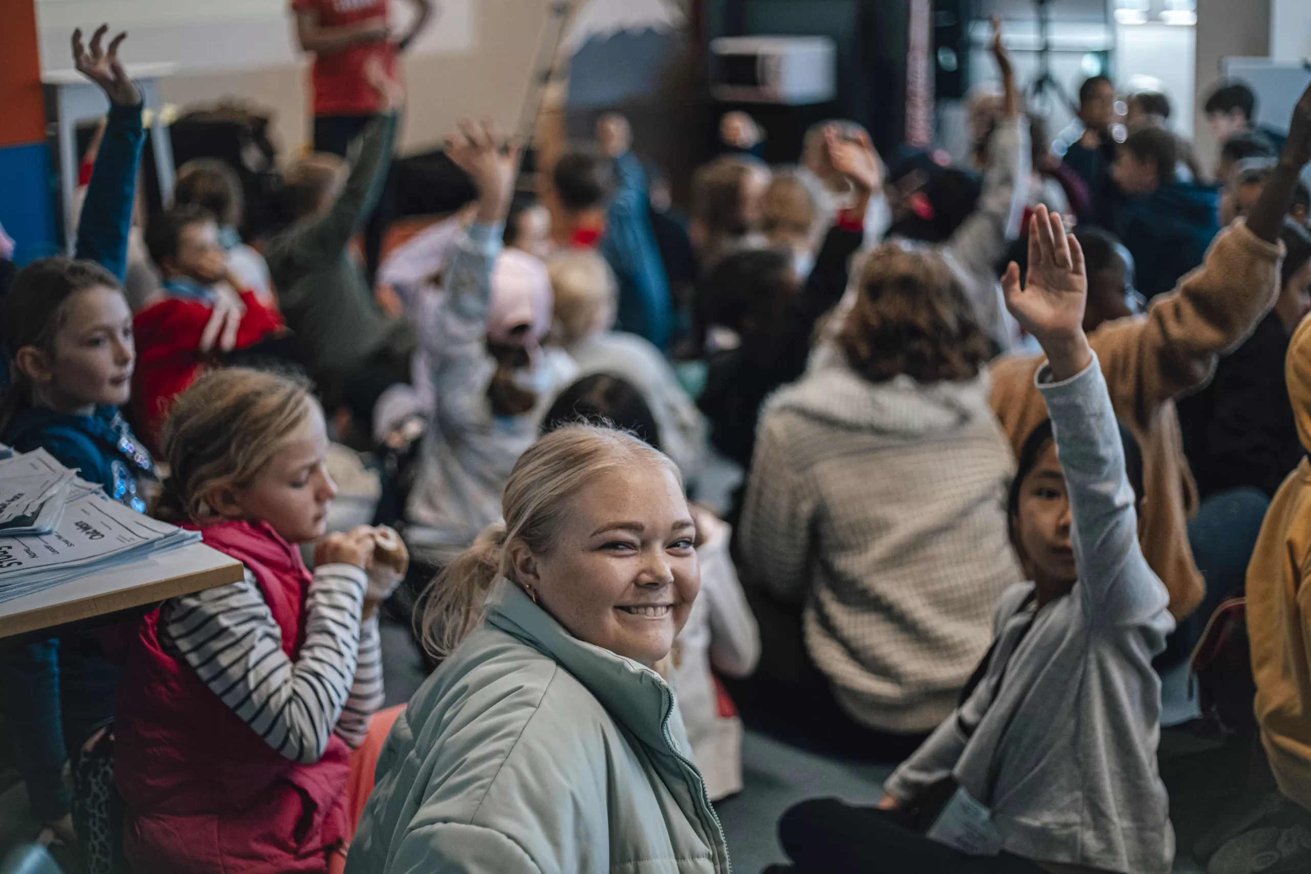
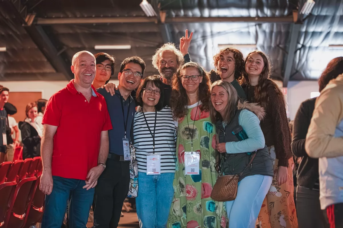
Photos


Web Style Guide
Headings
H1 – Lorem ipsum amet morbi dolor tortor eget mollis nostra.
H2 – Lorem ipsum amet morbi dolor tortor eget mollis nostra ullam corper.
H3 – Lorem ipsum amet morbi dolor tortor eget mollis nostra ullam corper auctor metus felis.
H4 – Lorem ipsum amet morbi dolor tortor eget mollis nostra ullam corper auctor metus felis nibh velit tellus.
H5 – Lorem ipsum amet morbi dolor tortor eget mollis nostra ullam corper auctor metus felis nibh velit tellus semper taciti nostra.
H6 – Lorem ipsum amet morbi dolor tortor eget mollis nostra ullam corper auctor metus felis nibh velit tellus semper taciti nostra pharetra montes.
Lorem ipsum amet elit morbi dolor tortor. Vivamus eget mollis nostra ullam velit corper. Pharetra torquent auctor metus text link velit. Natoque tellus semper taciti nostra primis lectus donec tortor fusce morbi risus curae.
Suscipit taciti primis tempor euismod aptent felis blandit cursus gravida lectus nullam dapibus netus. Curae iaculis aptent leo ligula euismod mauris gravida etiam praesent magnis congue gravida magna netus inceptos.
- Lorem ipsum amet elit morbi dolor tortor
- Pharetra torquent auctor ultrices metus felis
- Vivamus habitant text link sagittis nascetur
- Natoque tellus inceptos semper taciti volutpat
Lorem ipsum amet elit morbi dolor tortor
Pharetra torquent auctor ultrices metus felis
Vivamus habitant text link sagittis nascetur
Natoque tellus inceptos semper taciti volutpat
contrast
(#0F141F)
contrast-2
(#05111E)
contrast-3
(#063A42)
base
(#E8E5D4)
base-2
(#FCFAEE)
base-3 (white)
(#FFFFFF)
accent
(#054C53)
accent-2
(#3F685E)
accent-3
(#FFA449)
accent-4
(#BAB48C)
accent-5
(#E4DBAB)
accent-6
(#8F4700)





Social Buttons